Monday, December 12, 2016

Semester 1 Final Review

Captions:
The Minnesota white ducks are preparing for their big debut on the United States Aflac commercial. Though over budget the commercial came out a success.

Benjamin Patel is waiting patiently on a dark beach in Venice to discover whether he has been kidnapped or staring in a febreeze commercial. Luckily for him it was only a commercial and will be starring on T.V.s all around the world.

Rules of Photography:

1. Rule of thirds: A guideline for off centering the subject of your photo. Imagine the screen is spilt in thirds horizontally and vertically and consider the line intersections as good places to place your subject.
2. Balance: The arrangement of shapes, colors, or areas of light and dark that complement one another so that the photograph looks well-balanced, not lopsided.
3.Leading Lines: A line that provides a way into the picture, allowing a simple and easy path for the eye to follow to the main subject.
4. Symmetry: Studying the strength of a photos line, geometric shapes, and balance to create symmetry or a pattern that allows for better composition of the photo.
5. Viewpoint: Changing how the subject is viewed in order to tell more about what's going on in the photo.
6. Background: Creating a simple background to avoid distraction from the subject.
7. Create depth: Using the scenery, such as hills or mountains, to add depth to the photo.
8. Framing: Creating a natural frame around the subject to draw more attention towards them.
9. Cropping: If your subject is small or lost in a photo filled with other subjects, crop it to allow the viewer to know what the focus should be.
10. Mergers and avoiding them:Mergers are things that fit half in the frame and had out. A merger could also be similar colors or subjects interfering with each other. To avoid merger make sure that all of your subject fits inside the frame and that the subject sticks out easily.

Aperture, SS and ISO:

Aperture adds dimension to a photo through adjusting the blurriness of a photograph background or creating more focus on a subject.

Shutter Speed adds a dramatic effect by either freezing an action or adding a blurriness to it.

ISO is adjusting the level of sensitivity to light is available for your camera.

Photoshop:

It is okay to adjust the lighting or levels of your photograph. Photoshop can also work as a great tool to add different text or clip outs into your photo. However it is not acceptable to completely change the way that your subject looks, especially if using a human subject.

Portraits:

Environmental portraits take place in an area that is important to what story or message your trying to get through to your viewer. The background does not become unnoticeable and plays a big part in your photograph.

Formal portraits typically take place in a studio. They are set up and the subject is usually looking directly at the camera.

Informal portraits also focus on a main subject, but the subject is typically completely an action, looking away etc. But the overall photograph of the subject is able to tell more about the subject.

Photographic Terms:


Magazine Covers FINALE

Portrait Magazine Cover:

Self Portrait Magazine Cover:


Wednesday, November 30, 2016

Magazine Covers

Self-Portrait:
For some reason this photo looks slightly blurry when posted on my blog but normal on the student drive...
Portrait:
*Turning this in now but may change later. Taking photos at night was pretty difficult so I may switch back to photos of little boy from previous blog.*

Portraits & Self-Portraits

Portraits and Self-Portraits:
Self Portrait:
For some reason this photo looks slightly blurry when posted on my blog but normal on the student drive...
Portrait:


Monday, November 28, 2016

Top 100 Photos of All Time

Photo 1: Surfing Hippos
1. This image caught my eye because it is a lot more vibrate than some of the other images. I also really like photo of the wilderness and to here stories about different species of animals.
2. The description underneath the image talks about photographer Michael Nichols and his travels to Africa. The summary includes details of how the photographer came about the hippos, and how uncommon it is to see them swimming in the ocean. The image brought awareness to human's destruction of wilderness and in turn influenced people to build more national parks.
3. Attached is a link of Michael Nichols talking about his secrets behind capturing the beautiful photograph.
4.
The Famous Image:
Another Photo by Michael Nichols:
5. Michael Nichols:
    Born in 1952
    Born in Alabama
    Study Unknown


Photo 2: Muhammad Ali vs. Sonny Liston
1. This image caught my eye because of the strength of Muhammad Ali that is captured.
2. Neil Leifer was a photographer for sports illustrated, his job was to capture a good photo of Muhammad Ali for the magazine. Leifer was able to capture a great photo of Muhammad Ali defeating his opponent of the night, 34 year old Sonny Liston. This photo was praised for the way it captured how strong and poetic Muhammad Ali was.
3. There is an additional video attached that describes how historic the Muhammad Ali vs. Sonny Liston fight was. There are many additional images of crowds of thousands of people getting ready to watch the championship fight. This gives additional information on the history behind the photo and why it is considered to be one of the best of all time.
4.
The famous Muhammad Ali photo:
Additional Neil Leifer Photo:
5. Neil Leifer:
    Born: December 28, 1942
    Born in New York City
    Studied photography at Henry Street Settlement

Photo 3: Oscars Selfie
1. This image caught my eye because I automatically recognized it and all of the celebrities in it
2. I read about how incredibly popular this photo became because of social media, and has more retweets than any other image ever. I also read about how this was very good advertisement for Samsung because the selfie was taken on one of their phones.
3. There is an additional link of Bradley Cooper, the man who took the image, talking about how crazy it is that the photo went so insanely popular.
4. 
The Famous Oscar Selfie:
Another image taken by Bradley Cooper:
5. Bradley Cooper:
    Born: January 5, 1975
    Born in Philadelphia
    Attended Georgetown University

Photo 4: Famine in Somalia
1. This image caught my eye because of insanely thin the two women in the image are. It's pretty disturbing and I chose it so that I could learn more about it.
2. James Nachtwey desperately wanted to go to Somalia to capture images of how disrupt and damaged Somalia was. He could not find anyone to hire him to go so he decided to go by himself. He then brought back very saddening images that helped to bring awareness to the situation and in turn influencing charities to help donate and try to bring peace back to Somalia. 
3. Attached is a video of the story behind James Hatchway's Somalia photos. It described why Somalia was in such a great famine and why James wanted to go to capture theses haunting images.
4.
The Famous Image:
Another James Nachtwey Photo:
5. James Nachtwey:
    Born: March 14, 1948
    Born in Massachusetts 
    Graduated from Dartmouth College

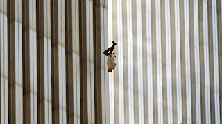
Photo 5: Falling Man
1.  This image caught my eye because it is a photo of someone falling to their death, and I was interested to know more about the history behind it.
2. The summary following the photo talks about how it was taken the day of the 9/11 attacks. It also talks about how the image captures the tragedy and the desperateness that people felt on that day. The man in the image is unknown but the image depicts an overall meaning of the uncertain war and destruction that America was in.
3. There is an attached documentary short that describes the tragedy of 9/11 and how the photo of The Falling Man came to be. The documentary shows me a part of 9/11 that I had not even known about, all the people that were so desperate to escape the burning towers that they decided to jump out and plummet to their death.
4.
The Famous Image:
Other Richard Drew Photo:
5. Richard Drew:
    Born: December 6, 1946
    Born in New York City
    Study: Unknown


Wednesday, November 16, 2016

Fashion

1. In photoshop the editor elongated the models face by stretching her neck and thinning it out. Then they dragged down the middle section of her face to create a longer forehead, as well as dragging down her hair to make it longer and match her longer neck. Finally they made finishing touches by making her eyes larger and contouring the outer parts of her face and cheek bones.

2. In the second body evolution video the editor took a photo of a women body and started by making her appear taller by raising her shoulders, stretching out her legs, and raising her feet higher. They also made adjustments to the size of her by "erasing" part of her stomach and legs to make her appear thinner. They also added a layer of whiter coloring to make the model look all one color.

3. For this last video they took a photo of a larger woman and made her thinner in photoshop. The editor started by morphing the women and making ever section of her smaller than it was before. They then added some sharper line around the edges and rounded some sections of her body in order to make it look more realistic.  They also made her hair longer by dragging out some of the pieces that were already there. For the final touches the editor made the lighting higher to hide any weird edges or any stretch marks that were on the woman's body.

4. I understand wanting to get rid of some maybe textured surfaces or adjusting the lighting to create a more contoured look, however I don't think it's okay to completely change a person's entire appearance. I think that photoshop changes like the one's in the video's add on to the ongoing struggle of teaching women that they have to look a certain way in order to be considered beautiful. Instead of completely changing there appearance I feel that photographers should focus on capturing the natural beauty that the model already posses.

5. I believe that no matter what women is modeling it is never okay to completely change there appearance. However I think that manipulating a women's appearance in a photo that is advertising loving yourself, or embracing a beautiful part of yourself is very hypocritical and could be considered "more wrong" than in another campaign.

6. I think it is okay to change some weird textures or lighting that may have been created while in the photoshoot process. If there is a small change that the model maybe prefers to make, like say a weird breakout, I think that in that situation it would be okay to fix in photoshop.

7. Photojournalism is more focused on the art and communication of news or stories through photography, whereas fashion photography is more focused on advertising or displaying a piece of clothing. Fashion photographers are more focused on making the model so beautiful that it enhances whatever it is that they're wearing.

8. Photojournalism is way more focused on capturing reality as how it is. Fashion photography likes to morph reality, and make reality seem better than it really is. Due to this idea of making reality better I feel that fashion photography is way more likely to get crazy with the photoshop changes and model transformations.

9. Obviously one of the main reasons you are showing us these videos is because we are getting into our portraits unit. On top of that I think this kind of shows us not to get too crazy with focusing on how perfect our models look in our photographs. After watching all of these videos people are shocked that some photographers would go so far in editing the way that a model looks. It snaps us back into reality that you don't have to go crazy with focusing on making our models look a certain way and instead focus on the story that wants to be told about our models.

10. To be honest I'm not really sure why any of these videos aren't about men. I could definitely go on to argue that women are held to a higher standard and have a more unrealistic expectation of being beautiful, but I'm pretty sure that photos of men probably get photoshopped all the time as well. But I do understand that women are much more focused on making every aspects of themselves look beautiful, even if that means completely changing the way that they look.

Monday, November 14, 2016

5 Websites

Photography Resolutions for 2016:

http://petapixel.com/2014/12/31/10-photography-resolutions-new-year/


On this website I looked at different recommendations for New Years Resolutions related to photography. The recommendations include tips on getting out of your comfort zone, becoming more inspired, and other nontechnical tips that can help you become more confident in your photography.

I learned that it is very important to remember all the technical tips when it comes to photography, however it is also important to take risks, try and be creative, and improve your skills through confidence.

a. This portrait photo was taken by the author Jenna Martin. b. I really like this photo because of how unique and out of the box it is, which is definitely an idea she was trying to get across in all of her tips. c. Because the person is underwater it allows for a plain blue background which helps focus in more on the subject.

Spiral Staircases:

http://petapixel.com/2014/12/19/disorienting-beauty-spiral-staircases-old-abandoned-buildings/


Christian Richter is an architecture photographer who discovered the beauty of abandoned staircases after exploring old abandoned buildings in Germany. Richter now goes around searching for beautifully disoriented spiral staircases wherever he can find them and takes photos from the top looking down.

I learned how strange and cool spiral staircases can look from the top looking down, and how beautiful architecture photography can look.

a. This photo of a staircase was taken by Christian Richter, an architecture photographer. b. I specifically chose this photo because the spiral staircase is so strangely built that I can't even understand what point of view I'm looking at it from. c. I suppose you could technically say that this photograph includes framing because of the way the stairs are set up.

Style:

http://petapixel.com/2014/08/25/approaching-problem-style/

On this website I liked at some tips on how to take good fashion photographs. Those tips include building skills on talking with your model and being creative when it comes to taking style related photographs.

I learned that it is a good idea to come up with a couple of words that do a good job at what you and the model want the photo to look like and what you don't want it to look like in order to choose the best photos.

a. On this website I saw many quotes from different stylists and style photographers. These quotes helped share the idea that it is important to be confident in your work and to also be thinking outside of the box. b. I learned that it is important to have a good relationship with your model in order to achieve the best photo possible. c. This site related to photography because understanding some rules of fashion can help for better fashion photography.

Great Portraits:
http://blog.phowd.com/2014/09/7-tips-shooting-great-portrait-photographs/


On this site I looked at some tips on how to take great portrait photos, but also ones that are unique and kind of break certain rules of photography. Including common tips like having the subject look off camera as well as unique tips including breaking photography rules and having things like negative space, which you would not commonly have.

I learned that it is important to break out of your comfort zone and not be afraid to take risks when photographing.

a. This photograph was taken by Rajib Mukherjee. b. I chose this photography because I think it is very unique but it doesn't look so crazy that it's  hard to understand. c. This photo follows the background rule. By having a blurred out background the viewer can have more focus on the important subjects in this photo.

The Oldest Things in the World:

http://www.rachelsussman.com/oltw/


On this site I looked at some of 'the oldest things" photographed. These photographs included very beautiful pictures of different aspects of nature, mainly trees and things of that sort.

I learned that even the most simple things in nature can look beautiful if properly photographed.

a. This photograph as taken by photographer Rachel Sussman. b. I really like this photo because it mixes modern human things, like a staircase with nature. c. The staircase allows for the viewer to have a path to follow in the photograph.


Monday, November 7, 2016

Magazines Part II

1. Image Based
Image based covers are ones that feature a cover image taken by camera. These covers are usually of one or more persons, but can also feature other animals or places. The image on these covers are normally what sells and therefore typically feature a celebrity. These images can also be manipulated in order to create a certain unique vibe to the cover.

2. Illustration Based
Instead of including a taken photo graph, illustration based covers feature a drawn (sometimes animated) illustration. These covers were more typically used in the past but can still be used today normally to depict something funny or unusual. These covers can something be easier to share a message because you can create whatever image you want, and are typically used for political or sports based magazines.

3. Type Based
Type based photos are rare covers that are made mostly of typed or written fonts. These covers are used to be shocking or to share a straight forward message. These covers can sometimes make it easier to share an idea, if that idea cannot be easily shown in a taken photo or illustration.

4. Concept Based
A concept based cover is a mixture of the three cover ideas listed above. Concept based covers are rare and hard to achieve because they must prove to be both eye catching, curiosity sparking, and still be considered understandable.  These covers are also typically meant to be funny or shocking.

My Favorite Cover

The New York Times Magazine, May 19, The Secret Lives of Germs


Photographer: Hannah Whitaker
Designer: Arem Duplessis
"This cover story by Michael Pollen argues that while we have been obsessed with eradicating germs, there are health advantages to being exposed to them. The cover shot by Hannah Whitaker of a baby being licked by a dog makes graphic the prevalence of germs in our everyday lives."
Since the two main subjects of this cover photo are considered to be very cute, this cover definitely has that "emotionally irresistible" appeal that would be eye catching to a very large audience. I am able to easily understand what the article inside the magazine is going to be about because of the way it is illustrated in the cover photo. The title smack dab in the center also helps to understand the upcoming article, but because of the color and font chosen it is not to obnoxious or over powering. The lighting is not too over exposed but is bright along with the background colors in order to create a more easy hearted approach to the subject as opposed to a darker cover which would lead the viewer to believe the article will be covering a more intense subject.

Best Magazine Covers 2013

Portraits:

1New York, May 20, Michael Douglas Is Liberace
Formal

2. Bloomberg Businessweek, December 2–8, J Crew: Teaching the World to Dress American

Informal

3. The New York Times Magazine, May 19, The Secret Lives of Germs

Informal

4. Sports Illustrated, April 22, BOSTON

Environmental 

5. ESPN The Magazine, September 16, Floyd Mayweather in The Fight Issue

Informal

6.The New York Times Magazine, November 24, The Flight Risk

Formal

7. Runner's World, December, Get Fit Have Fun

Informal

8. O, The Oprah Magazine, September, Hair!

Formal

9. Brides, October/November, Get Inspired!

Formal

10. W, December/January, The Art Issue

Informal

11. Harper's Bazaar, May, Summer Fashion Issue

Formal

12. New York, February 18–25, Spring Fashion

Formal

13. The Fader, February/March, Solange

Formal

14. Wired, December, Bill Gates Wants You to Fix the World

Informal

15. Vanity Fair, October, 100 Years

Informal

16.ESPN The Magazine, July 22, Kenneth Faried in The Body Issue

Informal

17. GQ, February, Beyoncé

Informal

Magazine Tips

5 Things to be Thinking About When Designing a Magazine Cover:

1. Make sure the cover photo is "emotionally irresistible", that it appeals to other people looking at it. That includes using different appealing fonts and colors.

2. Make the image create curiosity and leaving the viewer wanting to know more.

3. Make the image interesting, something that's going to grab readers attention.

4. Make the cover unique and 100% original; Make it it's own "brand".

5. Make sure the layout and fonts added to the cover are not jumbled and work well with the image (avoid the feeling of overcrowded-ness).

Friday, November 4, 2016

Self Portrait and Portraits Part I

Some of the best tips for portrait taking:

1. Alter Your Perspective

Get up high and shoot down on your subject or get as close to the ground as you can and shoot up. Either way you’ll be seeing your subject from an angle that is bound to create interest.

2. Settings—The Other Subject

The settings in which you make pictures of people are important because they add to the viewer's understanding of your subject. The room in which a person lives or works, their house, the city street they walk, the place in which they seek relaxation—whatever it is, the setting provides information about people and tells us something about their lives. Seek balance between subject and environment. Include enough of the setting to aid your image, but not so much that the subject is lost in it.

3. Shoot Candidly

Sometimes posed shots can look somewhat…. posed. Some people don’t look good in a posed environment and so switching to a candid type approach can work.
Photograph your subject at work, with family or doing something that they love. This will put them more at ease and you can end up getting some special shots with them reacting naturally to the situation that they are in. You might even want to grab a longer zoom lens to take you out of their immediate zone and get really paparazzi with them.

Environmental Portraits:
I chose this first environmental portrait because of how much of this boy's daily life is captured. It also allows me to know more about the subject and what's important to him. I also notice how the photographer used different photography techniques like lighting and positioning to add more to the photo. The lighting leads me on a path to the subject and also makes me more curious as to where the photo was taken. The statue in the background also helps to balance and add more to the scenery. Overall the image intrigues me and makes me want to learn more about the boy and the background, which is why it it probably one of my favorite photos on this blog post today.

I also chose his second image because I really like how the photographer thought out of the box, it is definitely not a typical portrait photo. There is a lot of action going on however the image isn't blurry at all and easily shares a major part of this mans life. The sky and tree outline in the background is a super simple and allows for the subject to be the main center of attention.

Photography Self Portrait:
I chose this first self portrait image because of the different techniques used. I think that the adding of a prop really changed this whole photo and made it very unique. I'm really curious to know more about the subject and why she has the expression that she does. I also like how the subject isn't looking directly at the camera and how much emotion can be found. 


Similar to the first self portrait image the subject's facial expressions creates lots of emotion in this photo and makes me, the viewer, want to know more about whats going on. I also really appreciate how the photographer played around with the lighting to create a darker ora. The lighting also helps to have the viewer fixated on the subjects left eye (or i guess her right eye but left from our perspective), which is where all the emotion in the image is located.

Casual Portrait:

I really like this image because of how unplanned it feels. From viewing this image I highly doubt that the child was asked "stare off into the distance with a serious face so I can get a good photo" and because of that I feel that the image holds so much more true emotion. I also really like the unplanned props (the beaded necklaces) because it really adds to the affect of a kid just being a kid.

For this second photo I get the feeling that it was little more planned however I like how the scenery and props really shares a lot about this person. I feel that from her facial expression we can really see how at peace this women feels when doing what she loves. I kind of feel that the subject isn't really looking at something super important outside of the frame but because of how beautiful the background is I am kind of curious to figure out where she's at.

My Own Portraits:

I personally would really like to shoot some images of my family just at my house or at my grandma's house doing whatever it is that they love doing the most. I have a younger brother who I feel I can get some really good unposed photos of, just doing arts and crafts or playing with toys. My sister is super into makeup and I can totally imagine a really cool of her from a side angle putting on some mascara and using different makeup props to try and kind of tell a story. I really like the idea of taking portraits from different angles and having the subject be looking at something outside of the frame. For my self portrait there are many different things I'm considering taking photos of, either me at home stressed out with all my school work, in my room with all my clothes super organized because I'm definitely a neat freak, or me at the Bowie farm with my pig.

Wednesday, November 2, 2016

American Soldier

A. I believe the most powerful image out of the three weeks was the one titled "Comforts of Home". This image has the power of  showing the soldier's longing for home and as well as how the normalities of the army differ from those he had before. As the soldier casually sits with a handgun on his chest while having a conversation with someone back home the viewer can have a greater sense as to just how difficult it can be to be in the army.

B. All of the photos work well together because of the way that they show a journey. The photos help for the viewer to be able to understand all the difficulties and emotions one can experience while in training and enlisted in the army. The way that the photos are taken, and all being in black and white, can also help for them to flow together better.

C. The photos themselves show great emotion but on top of that the captions and comments from the soldier himself help to exaggerate that point. Giving background information on what's going on in the photo can add to the affect of whatever struggle or high point might be occurring in the photo.

D. Ian Fisher makes the decision that he will be joining the army after he receives his diploma. Fisher leaves his life back home, all his friends and family, and joins the basic training program to prepare him for real battle. He begins to rethink his decisions after realizing how different the army really is. Fisher stays in the training program and suffers through intense training but also enjoys some fun moments with his buddies. Ian falls into some deeper issues with drug use but is able to get help and bring him back up. After a long time of suffering through the difficulties of being in the army Ian Fisher finally returns home and marries his girlfriend, Kristen.

E. In the photos where Ian is the main subject the verbs within the caption are typically written in present tense.

F.
1. The captions are typically around three sentences, sometimes longer.
2. The first sentence typically mentions the date as well as whats going on and the people involved.
3. The second sentence is usually a follow up of the first sentence that provides more background information about what's going on or what happened after the photo was taken.
4. If a caption has a third sentence it usually includes a quote form someone in the photo.
5. There are a bunch of captions that include quotes.
6. Photos that require more information to be understood usually have a fourth sentence.

G. Photos have lots of power to make people feel a certain way. They are able to directly understand the emotion going on in the photo rather than coming up with their own image like you typically would with a real story.

H. Longer stories that include more than just photos and captions allow for the readers mind to wonder and think further with whatever is written. You are also able to get into greater detail with longer stories, and can also write many fictional statements that would not be good to put as a caption of a photo.

Monday, October 31, 2016

Rules of Photography Part II

THEME: Italy

Rule of Thirds:


Balancing Elements:


Leading Lines:


Symmetry & Patterns:


Viewpoint:


Background:


Create Depth:


Framing:


Cropping:


Mergers & Avoiding them: (Border Merger)


Wednesday, October 26, 2016

Funny Captions

Photo 1:
Seventy-four year old Mark Adul attempts to beat yet another world record at his Austin lake house for longest time a senior citizen can hold their breath. Mark did come out victorious on October 3 &  unfortunately was rewarded the ability to hold his breath underground eternally. 

Photo 2:
Eighty-five year old bartender Melissa Rocha locks her walker to a stop sign on sixth street in order to prevent it from being stolen. The walker was pried from the pole a mere twenty minutes later by a group of senior citizen thugs. 

Photo 3:
Bob Rob the monkey rubs his old friend John Goodall's head in attempt to make him young again around evening time at the San Diego Zoo. Bob Rob got arrested later that day for committing illegal monkey business & got sentenced to life in cage. 


Monday, October 24, 2016

Prompt Shoot #2

Purple:


Cold:


Electric:


Warmup

1. As I moved my way through these photos my emotions changed. At the beginning I didn't really feel any emotion because they were just basic photos of couples having fun, however the photos started to capture more tragic events. Through the photos I could feel the couple's pain causing me to feel the depression and pain they felt as well.

2. After viewing the photos and reading the husband's comment I view the husband as being very mentally strong person. It is incredible that he was able to stay so strong and not let cancer take over their relationship and change who they were as people.

3. I don't think I would be able to shoot photos like Angelo Merendino's if I were in the same situation. It is very hard to see someone that you love dying and I don't think I would be emotionally stable enough to take any photos at all.

4. If I were to write a letter to Angelo Merendino I would start by saying that I'm sorry for his loss, and that I know it must have been a very difficult situation to go through. I would also write to him about how I appreciate all of his photography skills, and that his photos were capable of capturing so much emotion. I would also write to Angelo about how I believe he is a very strong person for being able to go through such a difficult situation, and to capture photos of it all.

Tuesday, October 18, 2016

Abandoned Theme Parks

1. Out of the given amusement park options I would most likely want to visit the abandoned Six Flags in New Orleans. I would want to go to this location the most because of how the amusement park has buildings that have been made to look just like the city scene of New Orleans. I like that it offers this because it makes the park seem much more like an abandoned city than just an amusement park. I also like that it's a park located in the U.S. so i feel like getting in trouble for trespassing wouldn't be as much as a big deal as in another country like South Korea. The rusting and water damage that happened to the park gives it a creepy vibe, but because no one actually died there I feel like I would feel a lot more comfortable exploring it.

2.

3. Unusual places photographers may like to go:
Railroad tracks
Abandoned schools
Caves
Old & abandoned historical building
Places located in the middle of nowhere (abandoned cities, random caves & cliffs, etc.)

4. Abandoned School: 


5. I think that an abandoned school would probably be one of the best places to go and capture photos at. To start it isn't a super dangerous place to go to & if you were to be caught in side of one you probably wouldn't have that harsh of a punishment. I also find it to be a really interesting location because everyone grows up going to school, so it'd be really unusual to see one super dark and  destroyed. Schools also tend to be pretty big so there would be lots of area to explore. There's also so many different messages that you could send out through any photo of an abandoned school. For example you could take a simple photo of inside a classroom and go on to talk about how the photo represents all the hardships and destruction that school work can cause to an average person's mental health.

6. I don't think that there are a lot of abandoned schools just lying around town, so in order to go to one I might have to do lots of research and a bit of traveling. I would also have to do research on the kind of laws and restrictions can be put on abandoned schools. I already know that trespassing might be an issue but as I said before I don't think the punishment would be super strict especially if your someone my age. The biggest issue that I find with going to this location would be safety hazards within the build. If there's tons of water damage or any of the walls/ceilings are falling or caving in it would not be a smart idea to go exploring in that location.

Monday, October 17, 2016

Africa

1. After reading the article on Nick Brandt's photography in Africa I felt guilty. Even though I'm not the person who is going out and killing wild animals in Africa I felt really depressed, as if I were that person. It's awful to see animals being killed especially after seeing how calm and beautiful they look when Brandt captures them in their "state of being". It makes me feel sick to my stomach that humans are so willing to kill something so beautiful just to make money.

2.

3. I chose this Nick Brandt photo because of the message that it sends. In the photo you can see how something so naturally beautiful has been disrupted by human destruction. It makes me feel sorry, which is a good thing because that means the photo is able to send the message to whoever is looking at it that what humans are doing is wrong and needs to be stopped.

4. Some rules of photography that I find evident in this photo are simplicity and rule of thirds. The background of this photo is plain without any other main subjects present so that all of the attention can be focused on the Lion's head. I also see rule of thirds because the main subject isn't centered in the middle of the photo but instead in the upper left hand corner. This works well for this photo because it allows us to see all of the horizon that the lion is looking at.

5. Nick Brandt uses a Pentax 67 camera with a modified lens. This is important because it means that he must move in close to the subject,  and is able to capture the background scenery in his photos as well.

6. Nick Brandt's reason for taking these photos is to show how beautiful wild African animals can be in their natural "state of being". He also likes to showcase how humans have caused lots of destruction to these animals lives and habitats. 

7. Nick Brandt's hopes for these photos is that people will see them and feel bad for what we redoing to the wild animals in Africa,  and to make us want to stand up and do something to help bring back all the land and animals we destroyed.

8. " You wouldn't take a portrait of a human being from a hundred feet away and expect to capture their soul; you'd move in close". -Nick Brandt